Introduction
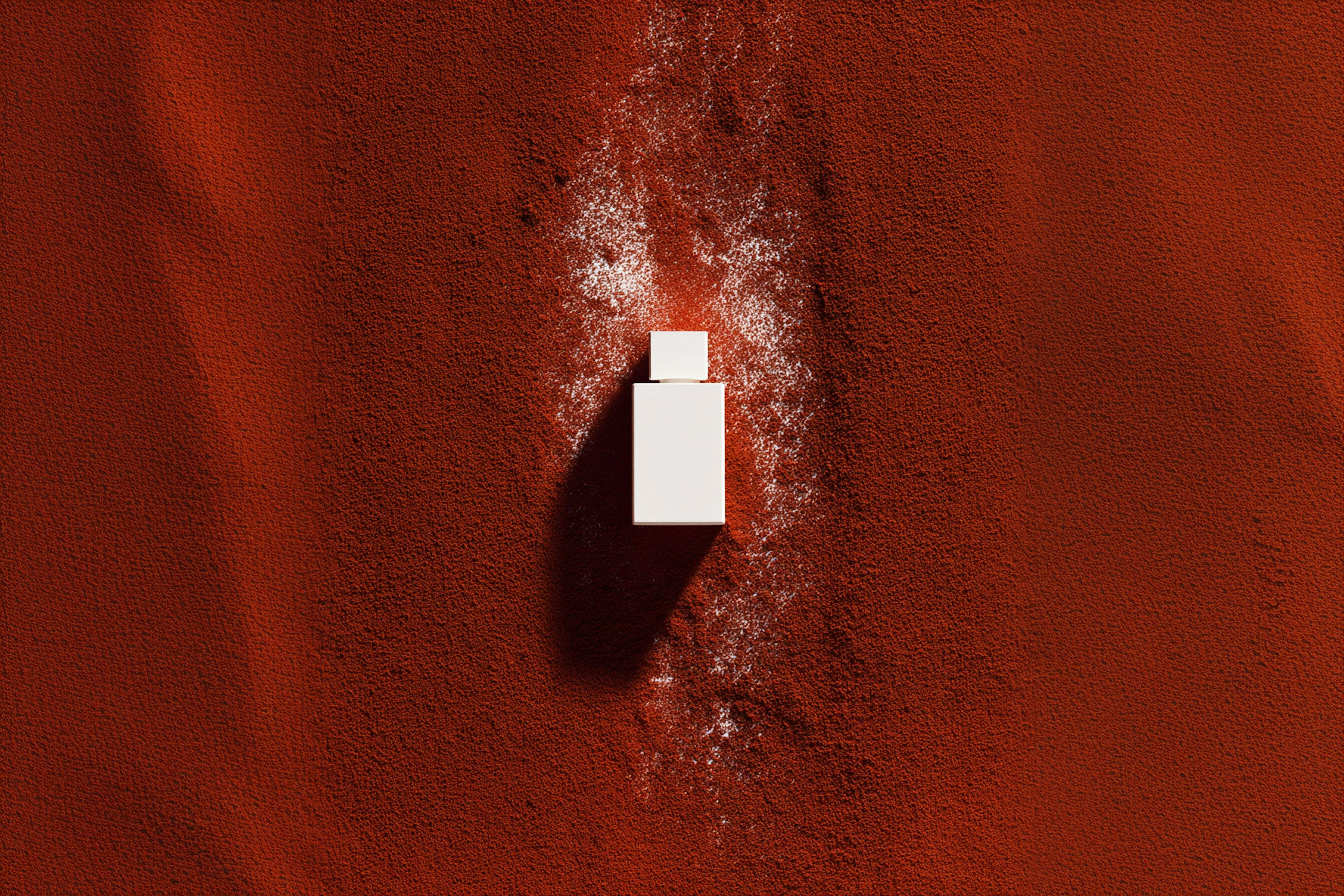
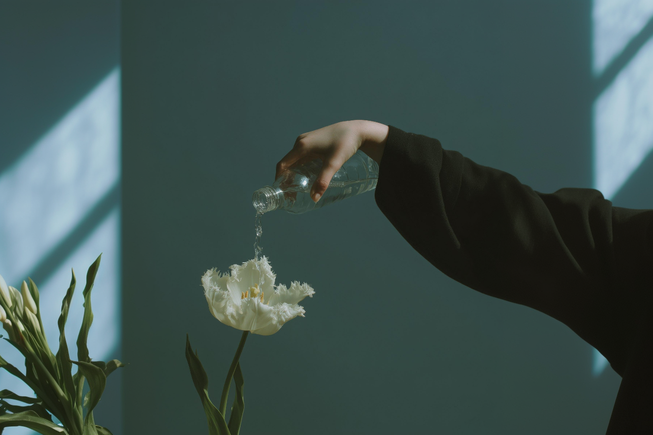
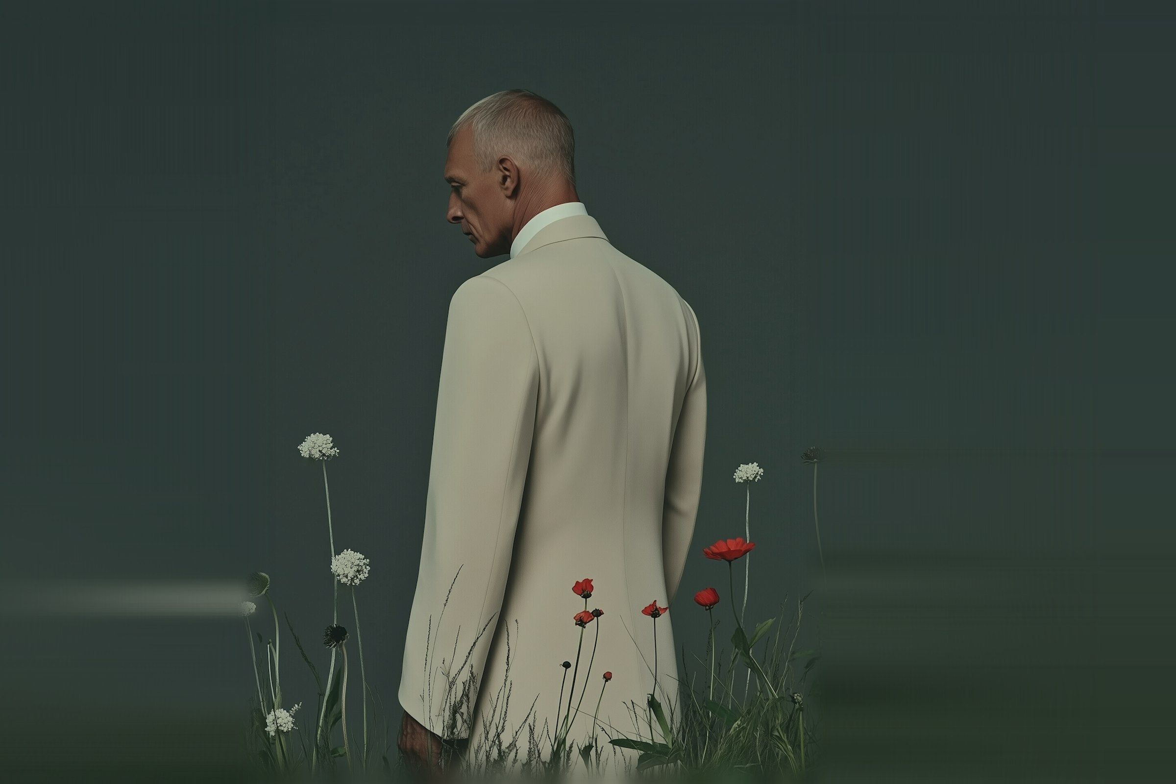
The brands we remember don't pick a side. Calvin Klein next to a desert; Aesop's clinical bottles in warm wood-panelled rooms; Aimé Leon Dore's heritage colourways on stark concrete. The tension between elegance and rawness isn't a compromise — it's the point.
This piece is about how that tension shows up in brand visuals, and how we approach it on client work.
Contrast as a tool, not an effect
Contrast in brand expression is easy to do badly. Pair a refined typeface with a "raw" texture, call it done, ship it. What's harder is making the contrast feel intentional — like the brand is saying something specific, not just trying to look interesting.
The frame we use:
- Pick one axis of refinement (typography, layout discipline, colour restraint).
- Pick one axis of rawness (material, photography style, motion).
- Hold the rest of the system steady. The tension has to come from those two, not from chaos.
What we look for in client work
When a brand can't decide between "elevated" and "grounded", it usually means the team can't decide who the customer is. The fastest way to resolve the visual debate is to resolve the strategic one — and the visuals follow.