Introduction
The most confident brands say less. They trust the audience to fill in what's not on the page. The least confident brands cram every value, benefit, and award into the hero section — and the audience learns to skim past all of it.
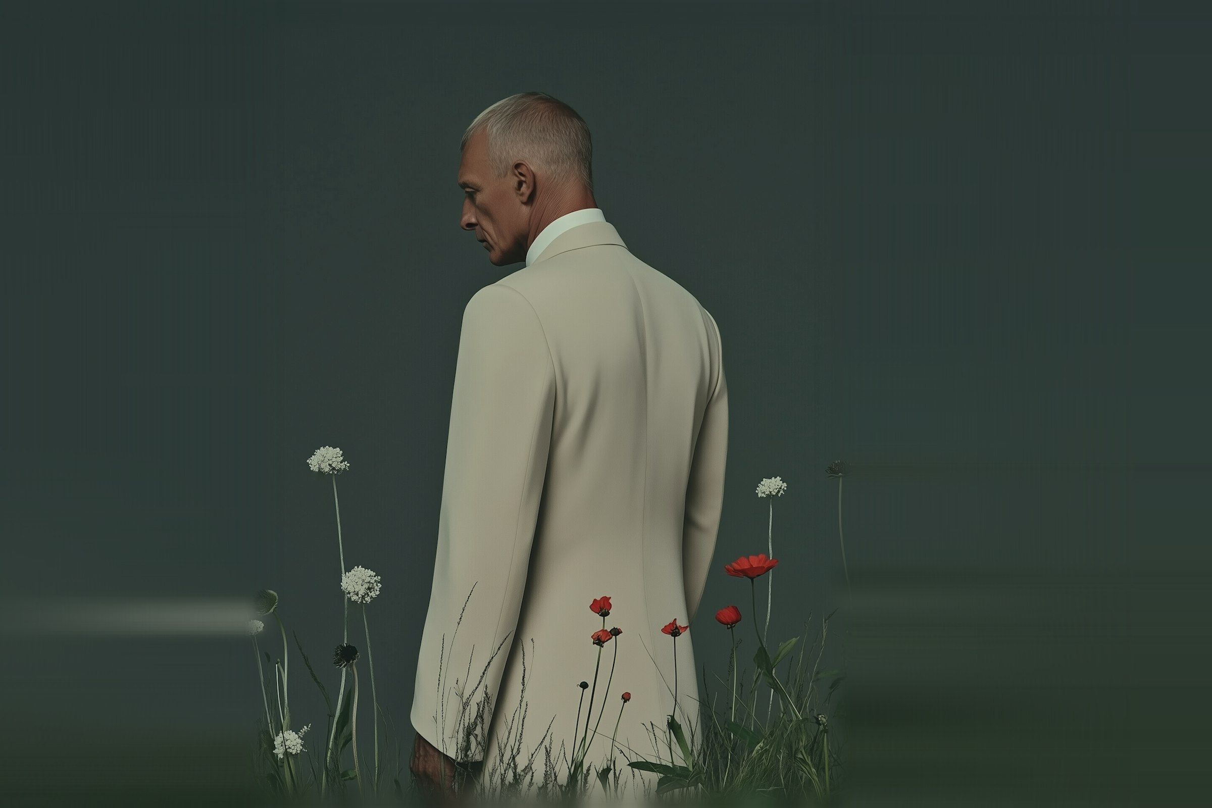
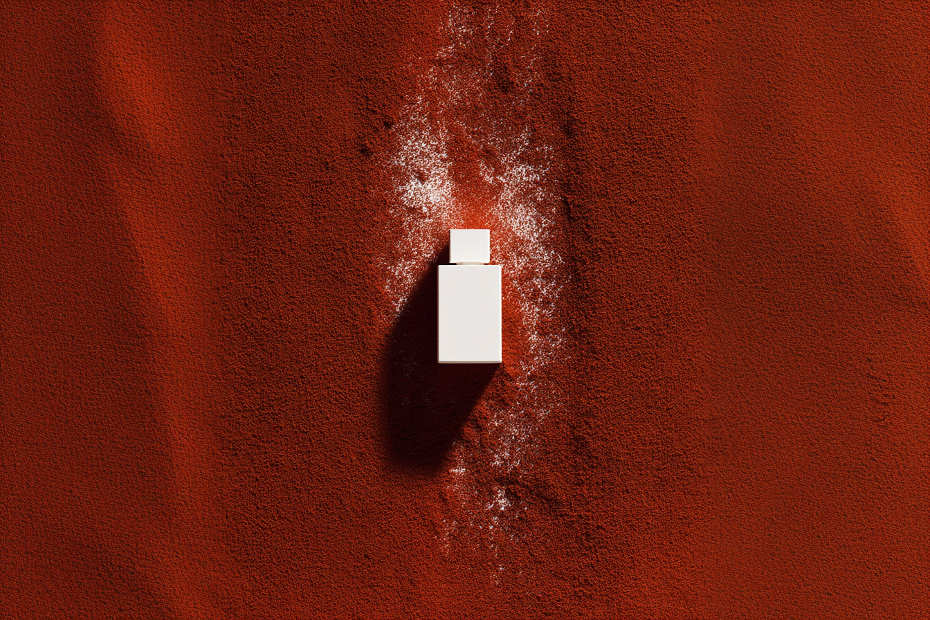
Where restraint actually pays off
Restraint isn't minimalism. Minimalism is an aesthetic; restraint is a discipline. The discipline shows up in three places:
- One headline per surface. If the hero is doing one job, every other element on the page can support it. If the hero is doing three jobs, nothing supports anything.
- One image per idea. A great photograph carries the room. Three okay photographs argue with each other.
- One material direction. Pick one — concrete, paper, glass, fabric — and let it carry the brand. Don't mix.
How to know you've gone too minimal
You can tell restraint has tipped into starvation when the brand stops looking like itself. If the work could belong to any of five other studios, you've removed too much. The goal is recognisable, not blank.